Bathroom design: Spa retreat esthetic is all about colour and texture
Goodbye sterile white and cool grey. Say hello to rich colours, textured tiles and a personalized luxurious space

Reviews and recommendations are unbiased and products are independently selected. Postmedia may earn an affiliate commission from purchases made through links on this page.
Article content
Just because the calendar has flipped a page doesn’t necessarily mean that everything in design has become so last year. But trends do shift, and that oh-so-important room in the house — no, not the kitchen — the bathroom is seeing a significant, esthetic shift. The aspirational spa bathroom vibe, created with expanses of white tile and stone with maybe some cool greys thrown in, has been fading out of favour over the last couple of years. That doesn’t mean that bathrooms aren’t still envisioned as retreats for relaxation, but the new look is all about infusing the space with warmth by utilizing colour and texture.
Advertisement 2
Article content
“There’d kind of be just one note in the space,” says Jessica MacDonald, interior designer and principal at Vancouver-based Studio Roslyn, referencing the passé spa palette. “You’d have a travertine tile floor and then white or cream marbles, lots of windows. That kind of thing. We’re realizing that to have that relaxing spa-like space, you don’t have to have a light, light colour palette because sometimes a bright white can feel stark or a little bit cold feeling.”
Article content
Janie Hungerford, principal at Hungerford Interior Design, agrees with that assessment saying, “I would say that bathrooms are no longer the really clean, sterile white spaces where there wasn’t any personality infused into them. They’re highly expressive. They’re a lot more functional.”
Advertisement 3
Article content

The options for introducing colour are varied. Walls are being transformed with all sorts of hues, including blues and greens. Hungerford says countertops can also bring in colour because of the variety of stone now available.
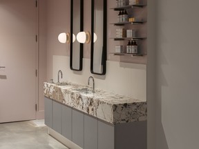
“It doesn’t just have to be a Carrara (marble),” she explains. “There are pinks and blues. It’s really endless and obviously, depending on a person’s budget, that will determine the stone we can work with, but we now also have so many manmade materials that look fairly authentic.”
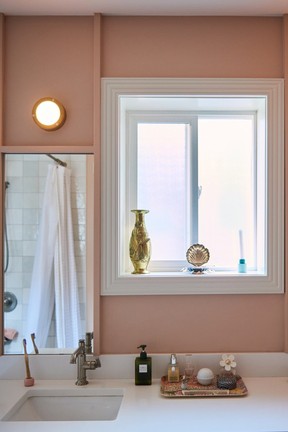
MacDonald says people aren’t as reluctant to use richer colours like blues, pale greens, or a dusty rose colour. They may stick to the greige tones in their main spaces, but they’re willing to try a bolder wall colour in the bathroom. “It is a space that you can play with a bit more and if you tire of it in a few years, mix it up,” she suggests.
Advertisement 4
Article content

Hungerford adds that infusing a space with colour can actually have a calming effect. “Colour can be a neutral for some people without it feeling overwhelming,” she adds.
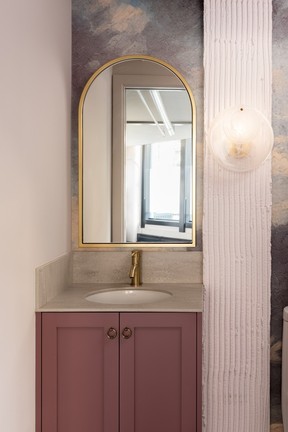
Wallpaper, which has made a comeback in the last few years, has become more popular in bathrooms, introducing colour and pattern that can create striking visual interest and personality for the space, MacDonald says. She advises using only commercial-grade wallpapers where there’s a bath or shower. “Residential grade has a very paper-like quality to it. The commercial ones (have) almost a vinyl texture, and they hold up really well in wet spaces,” MacDonald explains.
Switching up the use of colour also relates to hardware, be it for plumbing fixtures or cabinet handles and pulls. It’s now about mixing metal hues rather than utilizing one uniform finish throughout the room.
Advertisement 5
Article content
“I think people used to be scared of mixing metals,” Hungerford says. “It has to be done tastefully and thoughtfully, obviously. I think mixing of metals makes a space feel uniquely yours because it’s not all the same thing.”
The shift in metal tones is more about softer finishes, like satin nickels, and champagne colours, says MacDonald. But she subscribes to the mixing of metals, adding that gold hues or brass can work well with those finishes.
“You don’t have to be scared to have brass mixed. You can have a brass light fixture, and then you can have satin nickel plumbing fixtures,” she explains.
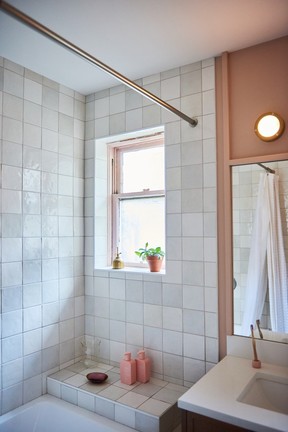
Applying a range of tile colours, sizes and textures is a defining component in creating warmer, more personalized bathrooms. According to MacDonald, tiles are smaller with a move away from the really large format tiles, like the marble ones, which have been widely used for many years.
Advertisement 6
Article content
“We’ve seen a lot of people really interested in a very Japanese esthetic with tiles,” MacDonald reports. “Tiles with a raked texture to them or even the finger, KitKat tiles which are really, really thin. They come in so many different beautiful colour tones like turquoises and blues.”
Macdonald adds that there is a resurgence in more historical styles of tile, such as from the 1940s or the ’50s, with a shift in shape from the ubiquitous subway tile to more of a square format like a four-by-four inch or even a two-by-two inch.
Hungerford observes that using handmade tiles is another way to incorporate texture in bathrooms.

“Not having the crisp, clean lines in tile is something we’re really seeing which helps with the bathroom not feeling sterile: imperfect lines and imperfect tiles,” she says. “With handmade tiles, you can see variation in each one. Not one tile will be the same.”
Advertisement 7
Article content
MacDonald also notes that texture is enhanced since the colour of handmade tiles will shift slightly from one to another due to their variation. “There’s this really beautiful quality that you get with that,” she says.
In terms of room design configuration, MacDonald and her firm have been getting a lot of requests for wet rooms. Wet rooms have been popular in the U.K. for a while, but that is owing more to space constraints, whereas here on the West Coast, they’re being imagined as private steam rooms.
“It is a very spa-like experience where everything is tiled, and there’s a drain in the centre of the room where everything is able to get wet, or you can have a steam,” MacDonald explains. “People will do some enclosed wet rooms with glazing. The appeal is to have your own steam room essentially.”
Advertisement 8
Article content
For tubs, MacDonald says that the deep Japanese soaking tub has a strong appeal for consumers. “They’re beautiful but also a great way to save space. They’re quite a bit deeper than is typical but not as long as a standard bath,” she says.
Hungerford adds that the Japanese toilets, which do the double duty of cleaning themselves and the user, are also in high demand.
Lighting is more than just optimum task lighting for grooming. Think visual impact, such as using fixtures as functional art or creating a serene ambiance for de-stressing.
“In a lot of the projects we’re working on, we love to play with different wall sconces in washrooms,” MacDonald explains. “Not necessarily placing it above the mirror but actually on the sides are really nice or a bit lower. You want to mix lighting levels, especially when you’re doing your makeup and that kind of thing.”
Advertisement 9
Article content
Hungerford says lighting can add visual drama to the space, especially a powder room where the lighting can be more for mood than task oriented. She suggests hanging a statement pendant over the vanity.
“We’re really loving having some LED strip lighting in strategic places in a washroom in kind of a concealed way,” says MacDonald. “So you just get a really beautiful glow of light.”
Personalization keeps cropping up as the dominant theme in contemporary bathroom design, whether by incorporating unusual cabinet pulls, changing lighting or plumbing fixtures, or simply repainting in a bolder colour. It’s about individualism, according to Hungerford.
“It’s curated and layered, and you’re able to create a different dimension and dynamic when you have unique things that aren’t all the same,” she says.
-

Must have home furnishing looks for the year ahead
-

A designer’s love of layered neutrals and clean-fresh style shines through in this Oakridge new build
-

Renovation: Modern farmhouse details breathe new life into a Surrey home
-

From 80s capsule to modern icon: How a Vancouver family’s eye for high-design furniture translated to a clean-lined makeover

