
The 8 bathroom layout mistakes to avoid – for a successful and long-lasting design
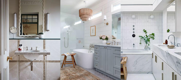
Avoiding bathroom layout mistakes will ensure that you create a bathroom design that is just as practical as it is beautiful.
The bathroom is often one of the smallest rooms in the home, and yet, it is a space that serves so many functions; your bathroom layout ideas need to be carefully thought through in order for you to get the most out of this busy space.
From incorrect fixture sizes to ignoring ventilation and the importance of good lighting and storage, we ask the experts to share with us their biggest bathroom layout mistakes to avoid – and how to get it right, instead.
Bathroom layout mistakes
Our bathrooms are no longer purely functional spaces where we simply come and go. Over the last few years, bathrooms have transformed to become hubs of stylish visual interest and statement modern design, with many bathroom ideas exploring the importance of creating a relaxing retreat in the home where we can comfortably spend more time and unwind.
Of course, there is much to think about when designing a bathroom, and our collection of the eight bathroom layout mistakes to avoid will only help you on your way to creating a truly stand-out space in the home.
1. Over-cluttering the space
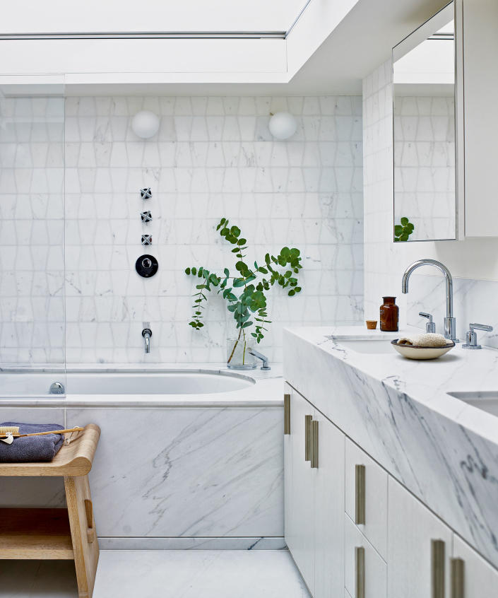
‘One of the most common mistakes when planning a bathroom layout is over-cluttering the space. While it is important to have all the essential elements of a bathroom in the room, it is also important to avoid the temptation of cramming too much into a small space. Too much clutter can make the room feel cramped and stuffy, and it can be difficult to navigate around,’ advises Jeanette Fusco, interior designer at HiHomePicks.
From towels to toiletries, to keep your space clean and clutter-free, everything must have its place, meaning that bathroom storage ideas are essential when planning your bathroom layout.
James Lentaigne, creative director at Drummonds also supports this and states, ‘in the bathroom, it’s important to keep toiletries easily accessible. Each area of the bathroom – sink, bath and shower – should feature some form of storage in order to keep toiletries close to hand when needed.’
2. Incorrect fixture sizes
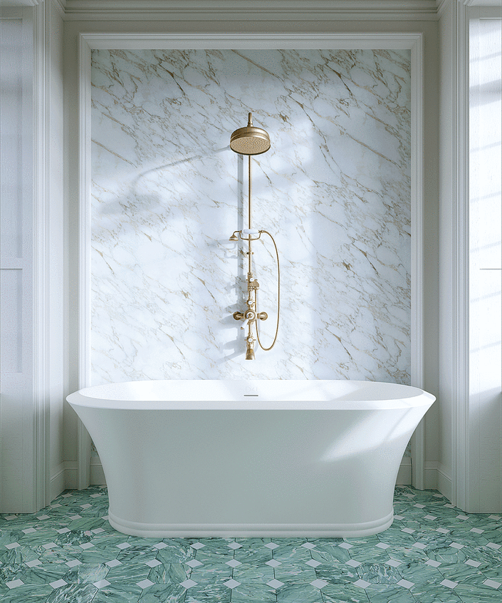
‘Another common mistake is choosing the wrong fixtures for your bathroom. Bigger isn’t necessarily better when it comes to fixtures, especially in small bathrooms. Too large of fixtures can make the room feel cramped and insubstantial, while too small of fixtures can make it look unfinished and uninviting. Choose fixtures that are the right size for your bathroom and that complement the overall design and size of the space,’ says Jeanette Fusco from HiHomePicks.
From choosing the right size bathtub to saving space with a combined bath and shower, having the correct right-sized fixtures can make all the difference for your bathroom layout.
3. Putting the toilet in the wrong place
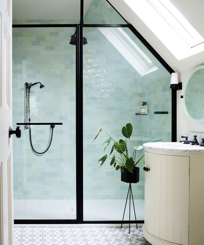
Barrie Cutchie, design director at BC Designs, says, ‘one thing we always advise not to do is to place the toilet in direct view of the door leading into the bathroom. This can often be the first thing people see, and you can make a much better impression with a beautifully designed bathroom vanity unit that showcases the design of the room, making the bathroom into much more than a purely functional space.’
4. Not considering ventilation
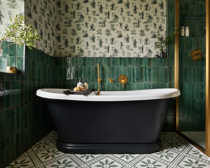
As the steamiest room in the home, having good ventilation is crucial for preventing mold build-up in a bathroom – as well as for keeping design features such as bathroom wallpaper ideas intact!
Barrie Cutchie explains, ‘think carefully about ventilation. The bathroom is the most humid room in the house so a breeding ground for mold. Make sure you have good ducting. Sometimes – especially in a large bathroom, you may even have to have two bathroom ducts – one near the shower and another near the toilet.’
5. Leaving enough room between each zone
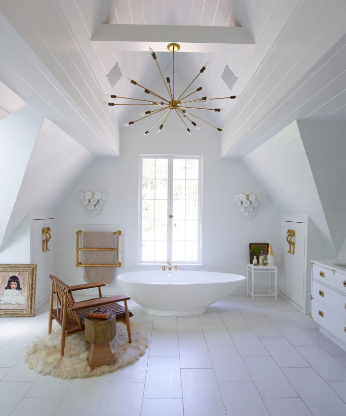
‘People can often try and fit too much into a bathroom and not leave enough space between products and each separate zone. This can make them difficult to use, hard to clean and spoil the aesthetics of the space.
For example, for a toilet, you’ll need at least a 45cm gap at either side and 76cm in front so that it is easy to clean and use. When it comes to the gap between a shower and a toilet, you need to make sure that whoever is using the shower can do it safely and comfortably. If space is tight, a wet room will be much easier as it doesn’t require fixed shower screens that take up considerable room,’ advises Barrie Cutchie.
6. Ignoring the importance of drainage areas
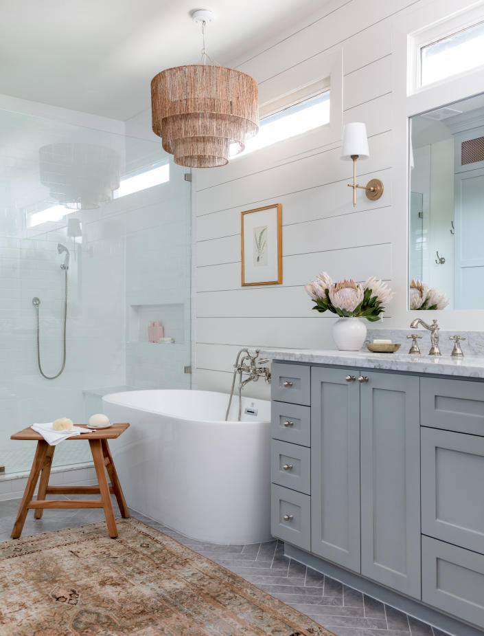
Of course, you cannot have a fully functioning bathroom without the right drainage. Your bathroom layout will need to be carefully planned around your drainage areas so all of your fixtures sit in the right place.
Lee Reed, head of design at Easy Bathrooms, says, ‘water drainage can be a huge headache in bathroom design, and homeowners can particularly fall foul to this when they are doing up their bathroom themselves. It happens when the water drainage pipe does not align with the plumbing drain, which can lead to bad odors. To avoid this bathroom remodel mistake, make sure you measure the bath and shower correctly before purchase and installation.’
For the perfect balance of practicality and beauty, Eric Bramlett, property expert and founder of Bramlett Residential also advises, ‘don’t overlook the importance of concealing things like pipes and wiring. While these elements are necessary, exposed pipes or wires can detract from the room’s polished appearance. Consider using recessed shelving or strategically placed bathroom tile ideas to hide these components within the walls or ceiling. This will create a more cohesive and visually appealing bathroom that you’ll love spending time in.’
7. Poor lighting
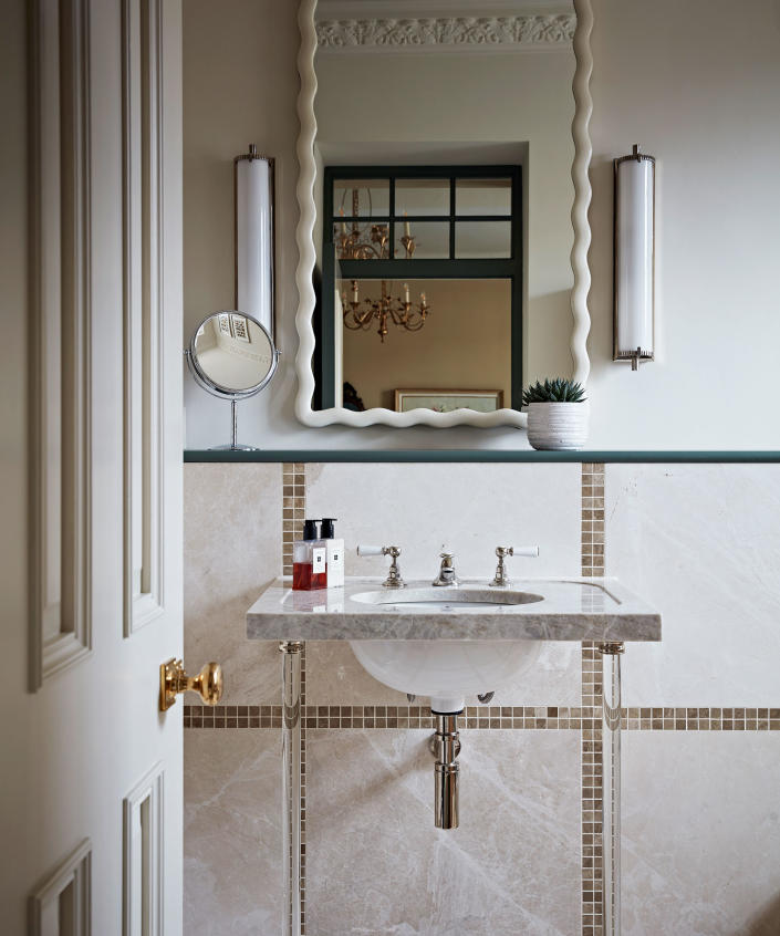
‘Poorly placed lighting can make a room feel dingy and dark, while too much lighting can be overwhelming. For your bathroom lighting ideas, plan for both task and ambient lighting in the room. Task lighting can provide illumination for shaving and grooming tasks, while ambient lighting can add a warm, inviting feel to the space. Consider adding a dimmer switch to the lighting as well, so you can adjust the lighting depending on the task at hand,’ says Jeanette Fusco from HiHomePicks.
Making the most of the natural light that floods into your bathroom is also another factor to consider when planning the layout and lighting ideas for your bathroom. For example, having your bathroom mirror ideas or a sink or vanity area placed near a window will perfectly illuminate these spaces; ideal for when grooming and checking your reflection.
8. Having too much open space
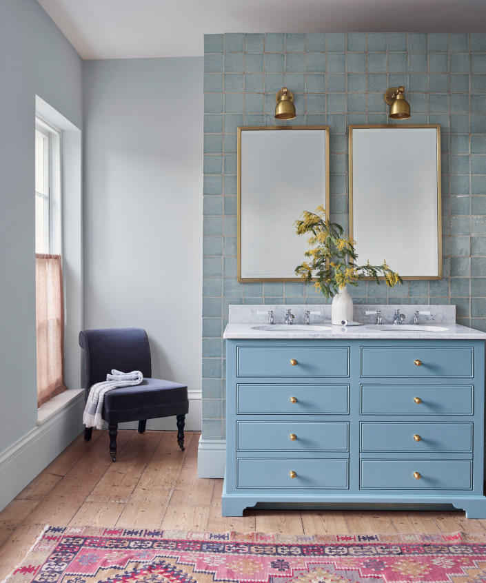
‘Another of the biggest layout blunders to watch out for is leaving too much open space in the bathroom. This can make the room feel vast and unwelcoming. Instead, try to create distinct zones within the bathroom for different functions and ensure there’s adequate storage to keep clutter out of sight,’ says Eric Bramlett from Bramlett Residential.
From introducing bathroom seating ideas such as occasional chairs and ottomans to zoning the space through bathroom rug ideas, simple additions such as these can transform the feel of your bathroom layout, and help to make a cold, open space feel more homey and inviting.
FAQs
Can a bathroom layout be changed?
A bathroom layout can be changed, but moving fixtures such as sinks, toilets, bathtubs and showers that require drainage, may mean you will have to adapt your existing plumbing – which can be an expensive process, so always take this into consideration when making big changes to an existing bathroom layout.
What is bad feng shui for bathroom?
The principles of feng shui in interior design draw on an ancient Chinese practice that focuses on arranging a room so it can achieve harmony and balance.
Bad feng shui in a bathroom would be caused by examples such as too much clutter, insufficient lighting, and leaving your toilet seat and toilet door open.
From the colors you use for your bathroom paint ideas, to having the right storage, there are many ways you can avoid bad feng shui in a bathroom, as we explore further in our analysis on bathroom feng shui.
Designing a bathroom is no mean feat, it is a process that requires extensive planning and research in order to create a space that embodies a beautiful blend of style and functionality, and learning the bathroom layout mistakes to avoid will only help to bring you one step closer to your dream design.