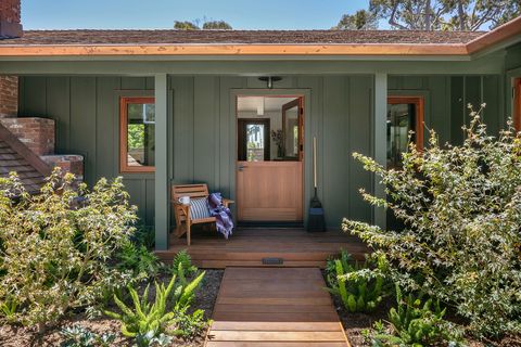
How Designer Raili Clasen Completely Overhauled a 1950’s Home
Interior designers rarely design the same project twice, and even more rarely get to redesign their own former home… for a client. California-based Raili Clasen, however, did both. The owner of her eponymous design firm recently completed the five-bedroom Newport Beach bungalow that she originally designed for her family in 2012. This time around, though, she lovingly decorated the house for a client. Clasen says, “After we bought the home in 2012, it was my first attempt at interior design, which then prompted me to start my design business.”
Since she and her family moved out, the house has undergone a few changes, including a pool, pool house, and 1,000 square feet of extra space, giving Clasen plenty of room to work. That said, she kept with the original home’s style: “We honored the California ranch style by keeping the open beam ceilings and elevated the design with rich mahogany windows and vintage hardwood floors,” Clasen notes.
As for the client, “He has elevated taste but didn’t want the home to feel formal in any way,” she explains. So Clasen infused each space with warm and comforting palettes and touchable, soft textures.
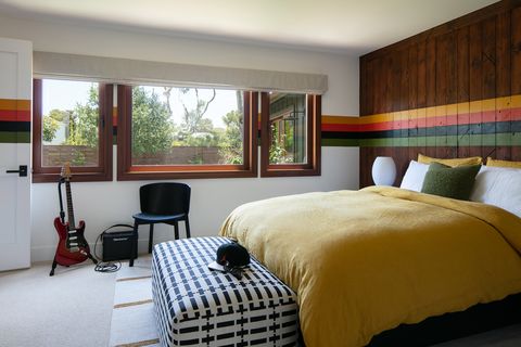
She also made it family-friendly for the client’s three young children, a delightful redo for Clasen who added smile-inducing details. “Since this was my former home, I had some fun ideas that I never punted on; my DIY skills went into overdrive.” She wrapped the bar beams with rope—a subtle nod to the Southern California nautical lifestyle—painted a set of 1970s-inspired stripes across the reclaimed wood walls in one of the bedrooms, and created her own light fixture using electric-ready rope from Etsy.
“The home feels like a mini resort, ready to have fun,” Clasen says.
Living Room
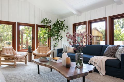
“My favorite element in this room is the painted ‘craggy’ wood siding that we added throughout both the living area and kitchen,” Clasen says. “We found the most worn wood planks with knots and gashes and installed it vertically with a fresh coat of white paint.” The space is complete with a custom sofa, a pair of Lawson-Fenning chairs, and a custom live-edge coffee table by Orange County Woodworkers.
Living Room Lounge
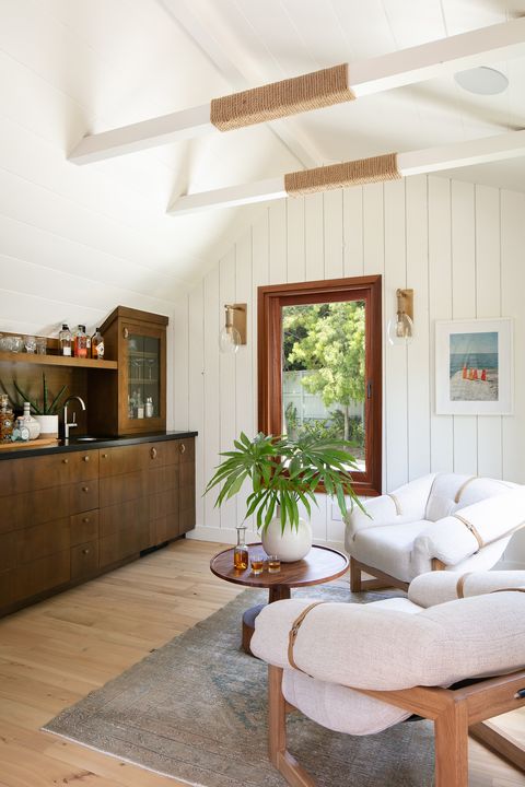
“The home had a perfect little bump-out space, most likely for a small office. We reimagined it as a full bar. The original beams were wrapped in rope to complement the vintage boat cabinet hardware,” Clasen says. She finished the look with a pair of chairs from Four Hands and a vintage rug from Shoppe Amber Interiors.
Primary Bedroom
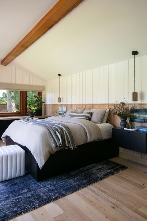
In the main bedroom, Clasen opted for a quiet and serene aesthetic. “The primary bedroom is one of my favorite spaces—mostly because of the beautiful views of the sunrise, swimming pool, and all of trees.” The best part is that the client doesn’t even have to get out of the custom built-in bed to enjoy the views.
Daughter’s Bedroom
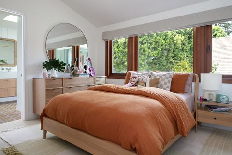
For a young girl with an appreciation for color, Clasen opted for uncommon shades that work for every age. “We wanted to tone it down so that she can grow out of it and still love the colors,” she notes. She draped a Cultiver duvet over the bed, hung a CB2 mirror over the Unison dresser, and called it a day.
Daughter’s Bathroom
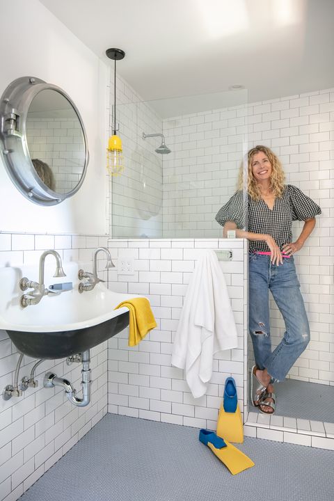
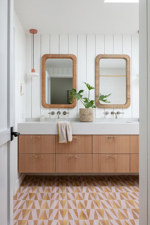
Clasen explains: “We had so much fun with tile throughout the home, but the daughter’s bathroom is special.” The designer used a funky pattern from Zia Tile and kept the rest of the space rather neutral, with wicker-wrapped Lulu and Georgia mirrors and decor.
’70s Striped Bedroom
Leave it to Clasen to design spaces that suit the lifestyles of her clients—even teenage boys. “The oldest son’s room reflects exactly who he is and what he loves. This teenager is no stranger to ’70s rock, and once we discovered that, we had to bring in the stripes.” The rest of the colors, including the yellow Cultiver bedding and the Like Leigh fabric on the custom bench, also tie in the theme.
Bunk Room
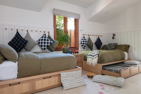
Clasen created the ultimate sleepover room with custom trundle beds by Orange County Woodworkers.
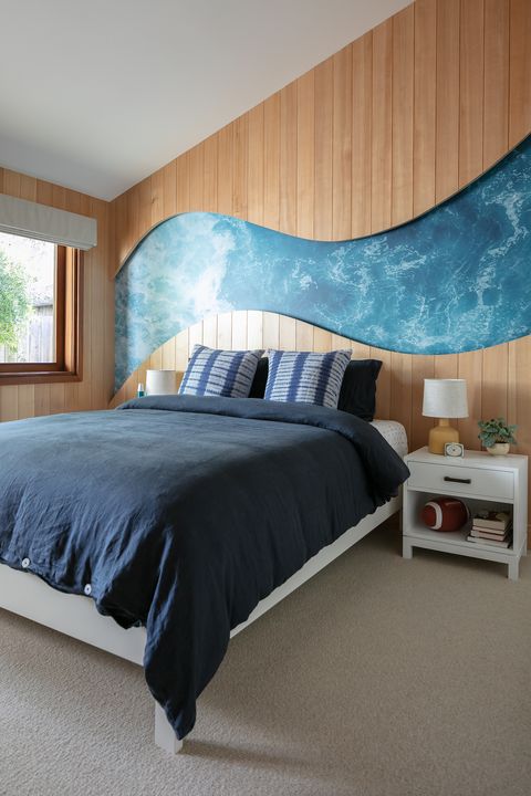
Wave Bedroom
In the middle son’s bedroom, Clasen designed a unique wall decoration that commands attention. “The wave was created by applying a photo mural directly onto the wall. Our woodworker created the frame once the mural was installed, cutting each piece to mimic the shape of a wave.”
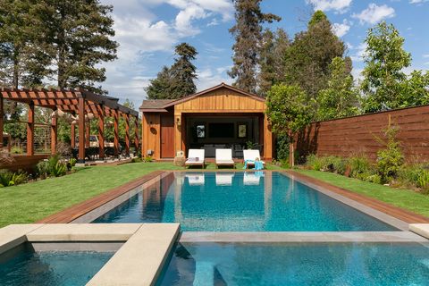
Pool and Backyard
Clasen says: “The client wanted to take advantage of the 20,000-square-foot lot, adding space for him and his three kids.” That meant the addition of a retaining wall to support the new pool, fire pit, garden, and pool house.
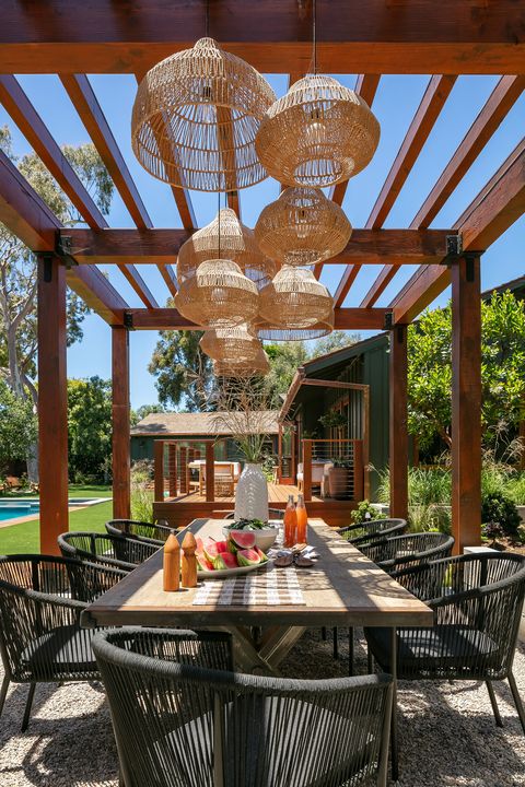
Outdoor Dining Area
“The inspiration for the outdoor space comes from creating the ‘resort vibe’ in cool boutique hotels. Having a fire pit, farm-to-table gardens, and space for outdoor entertaining was a major priority for this backyard,” Clasen says. She surrounded the client’s table with Teak Warehouse chairs and opted for a collection of hanging lights from Crate & Barrel.
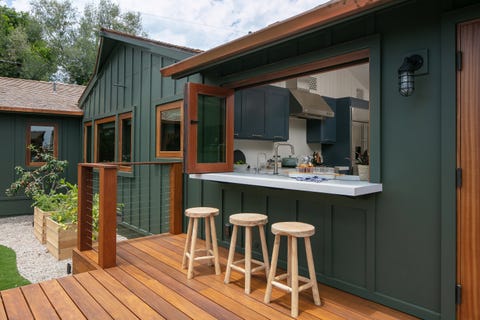
Al Fresco Bar
“The pass-through window services the entire outdoor area, allowing easy access to drinks and food while family and friends are enjoying the pool. Clasen notes. “The kitchen is on the other side of the window, so guests can pull up a stool and chat while the hosts are prepping the meals and drinks.”
Explore More of The House
Q & A
House Beautiful: Where did the majority of the budget go?
Raili Clasen: The client wanted the vision to come to fruition: He wanted mature trees and full-size plantings, so that he and his family could start enjoying the outdoor space immediately. So the budget for landscaping by Bridget Skinner increased.
HB: What was your favorite memorable detail?
RC: Since this was my former home, it was both nostalgic and a dream-come-true to have the budget and excitement from the client to give this special property its best chapter ever.
HB: Did any of the rooms stay as they were?
RC: The kitchen actually remained the same. We did add a pass-through window, updated the plumbing and lighting, and incorporated an island with a butcher block countertop, but the rest is the same. The kitchen is small, but with the remodel, we were able to build a comfortable pantry adjacent to the space.
Follow House Beautiful on Instagram.
Jessica Cherner is House Beautiful’s associate shopping editor and knows where to find the best high-low pieces for any room.
