5 unfashionable trends that are dating your interiors |
There are some home decor trends that are timeless, and then there are others that have well and truly past their expiration date. While there’s certainly no one size fits all formula; trends are entirely subjective, after all. There are still a few, five decorating ideas to be precise, that should be resigned to the history books.
But that is not to say that you shouldn’t have any of these home decor ideas if they truly bring you joy. Our affinity towards certain looks, materials, and colors has a lot to do with our personalities, environment, and experiences, so it is always important to choose decor that makes you happier at home, and take what the naysayers suggest with a pinch of salt.
Decorating trends that have fallen out of fashion
‘Fashion fades, style is eternal’ Yves Saint Laurent once said, and the same goes for interior trends, too. However, every so often it is fun to look back on the now outdated decorating trends that we once the height of fashion. But, if you still adore your fantastical feature wall, popcorn ceiling, or even your mirrored closet door, don’t take my advice. A forever piece is a forever piece no matter what I, or anyone else, thinks.
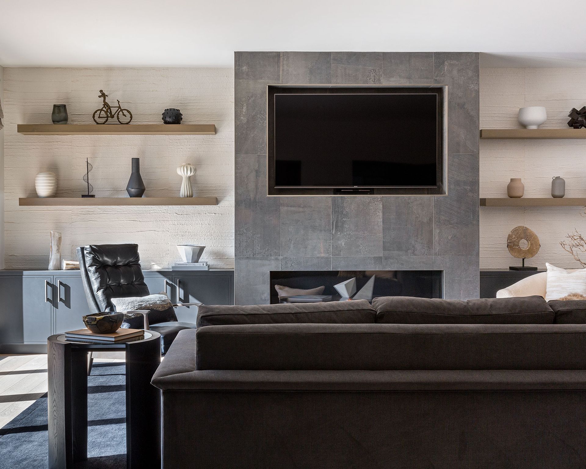
1. All-grey interiors
(Image credit: Kathryn MacDonald Photography / Kimberley Harrison Interiors)
In the West, grey is associated with dullness, boredom, and old age, so it comes as no surprise that this ‘trend’ was never going to go the distance. Being surrounded by too much grey leaves me feeling drained and depleted of energy, and I am not the only one who is tired of the endless velvet grey sofas, carpets, walls, and decor that have graced homes over the past decade.
‘The decline in all over grey color schemes reflects our ongoing desire to make our homes, in which we’ve all come to spend more time, feel special and layered,’ says Anthony Barzilay Freund, 1stDibs’ editorial director. ‘Patterns and colors, particularly those that evoke nature, are visually interesting and also feel emotionally reassuring.’
Having said that, I certainly don’t despise decorating with grey entirely, in fact, there is an art to perfecting a pared-back palette. Using a grey or white palette is all about adding depth and contrast in different layers and textures
‘The beauty of a neutral scheme is that it provides a wonderful scaffold upon which to hang accents of color,’ says Kimberley Harrison Interior (opens in new tab), the design studio that crafted the layered space above. ‘To make a grey or neutral palette feel designed and considered it’s important to mix and match textures and create subtle color saturations, albeit neutral ones and occasional bursts of color. Just because something is grey doesn’t mean it has to be plain: think about the application too.’
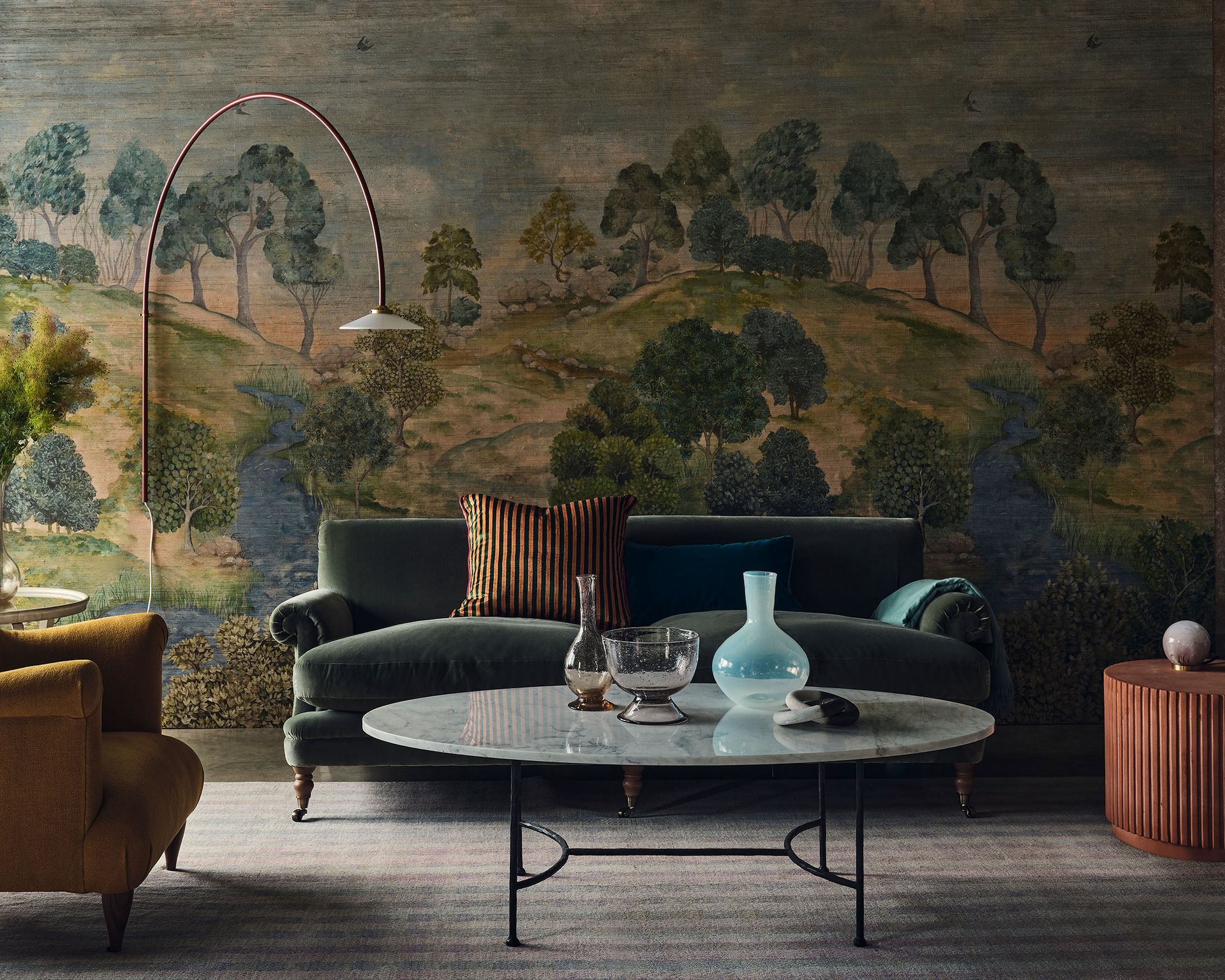
2. The feature wall
(Image credit: Simon Bevan / Future)
There is a lot to be said for a feature wall, but have we gone too far in our quest to add visual appeal? I believe so. There is something ‘unfinished’ about this dated trend. If you’re going to paint one wall, paint them all. If you’re going to wallpaper one wall, wallpaper them all. Alternatively, add decorative interest to your ceiling instead – it carries far more visual weight than a single wall ever could. I am all for being brave and bold when it comes to your interiors. No more half-measures; it is all or nothing from now on.
However, if you are going to do a feature or accent wall, then do it right. Scenic landscape murals are the biggest story in decorating today – wonderfully atmospheric and evocative, a feature wall mural will transform a space and capture the imagination.
Using wall mural ideas with a single dramatic image is a bold move, but it is a logical progression if you’ve already used patterned wallpapers. ‘A mural is a powerful tool for the adventurous,’ says Andy Greenall, head of design at Little Greene (opens in new tab). Many mural designs are now available as wallpapers, making them easier to achieve. ‘Three drops of paper that create a whole panel give an instant uplift,’ says Andy. Try painting all the surrounding walls in a complementary color taken from the mural.
3. A popcorn ceiling
(Image credit: Paul Massey)
Is there a former ‘popular’ decorating trend more despised than a popcorn ceiling?
A favorite interior design trend in the ’70s, popcorn ceilings are also known as acoustic ceilings or stucco ceilings. They were initially installed to help absorb sound from above or to cover up any pre-existing blemishes and imperfections in the ceiling. But like many trends from this time period, the popcorn ceiling has fallen out of favor and many homeowners are wondering how to remove a popcorn ceiling, or how to simply disguise this now loathed design feature. However, this is not to say that you should leave your ceiling completely bare – far from it.
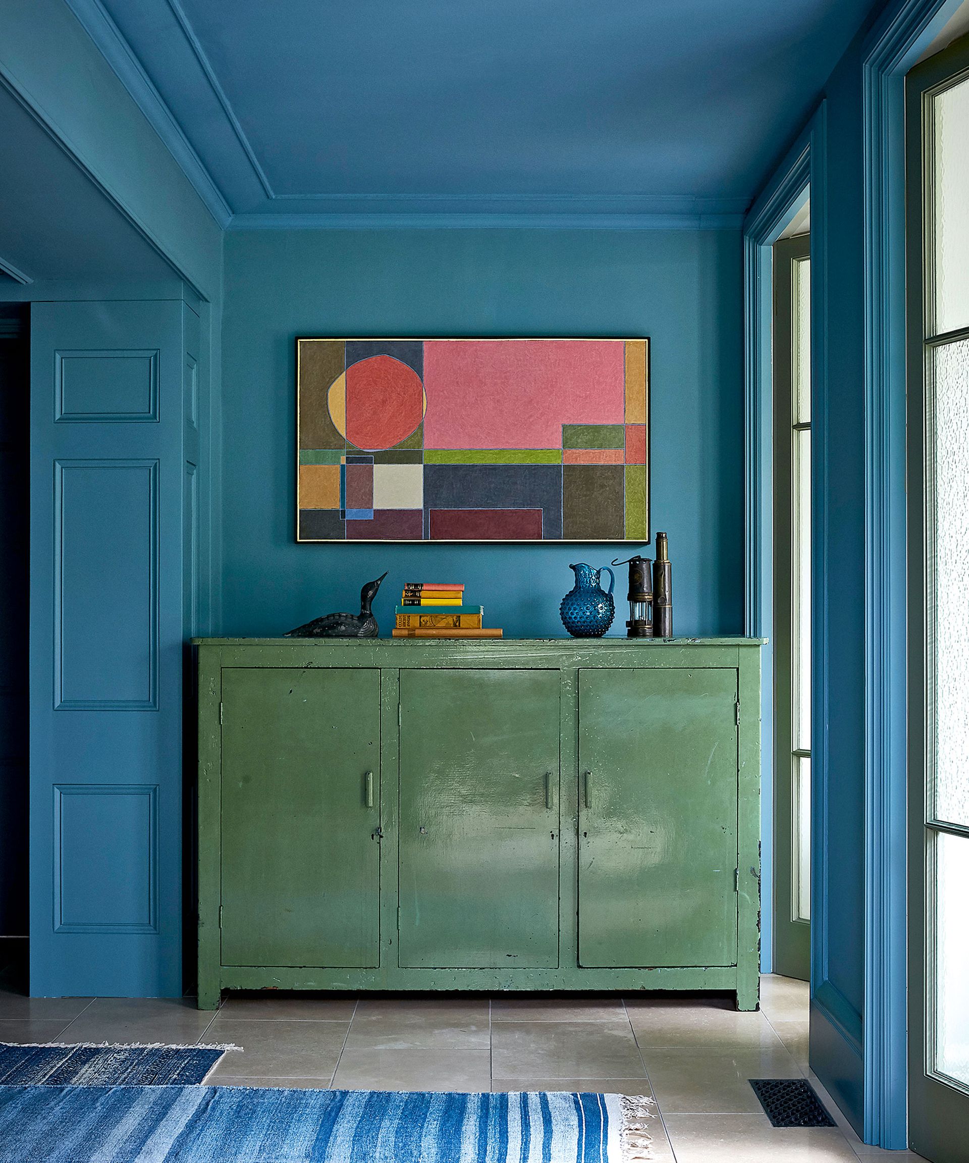
As mentioned above, this fifth wall is ripe for rediscovery. The ceiling holds endless possibilities for creativity and should be treated with the same consideration as any other wall in your home.
‘Ceilings are a great way of adding another layer of interest and making a space feel cozier. All too often they are an afterthought but we make sure to consider their potential,’ confides interior designer Nicola Harding (opens in new tab).
There is a multitude of ways to elevate your ceiling with materials, color, texture, and even wallpaper. ‘Ceilings have been overlooked in recent times,’ says interior designer Rachel Chudley (opens in new tab), ‘but when you visit historic houses, the ceiling is often treated as a masterpiece.’
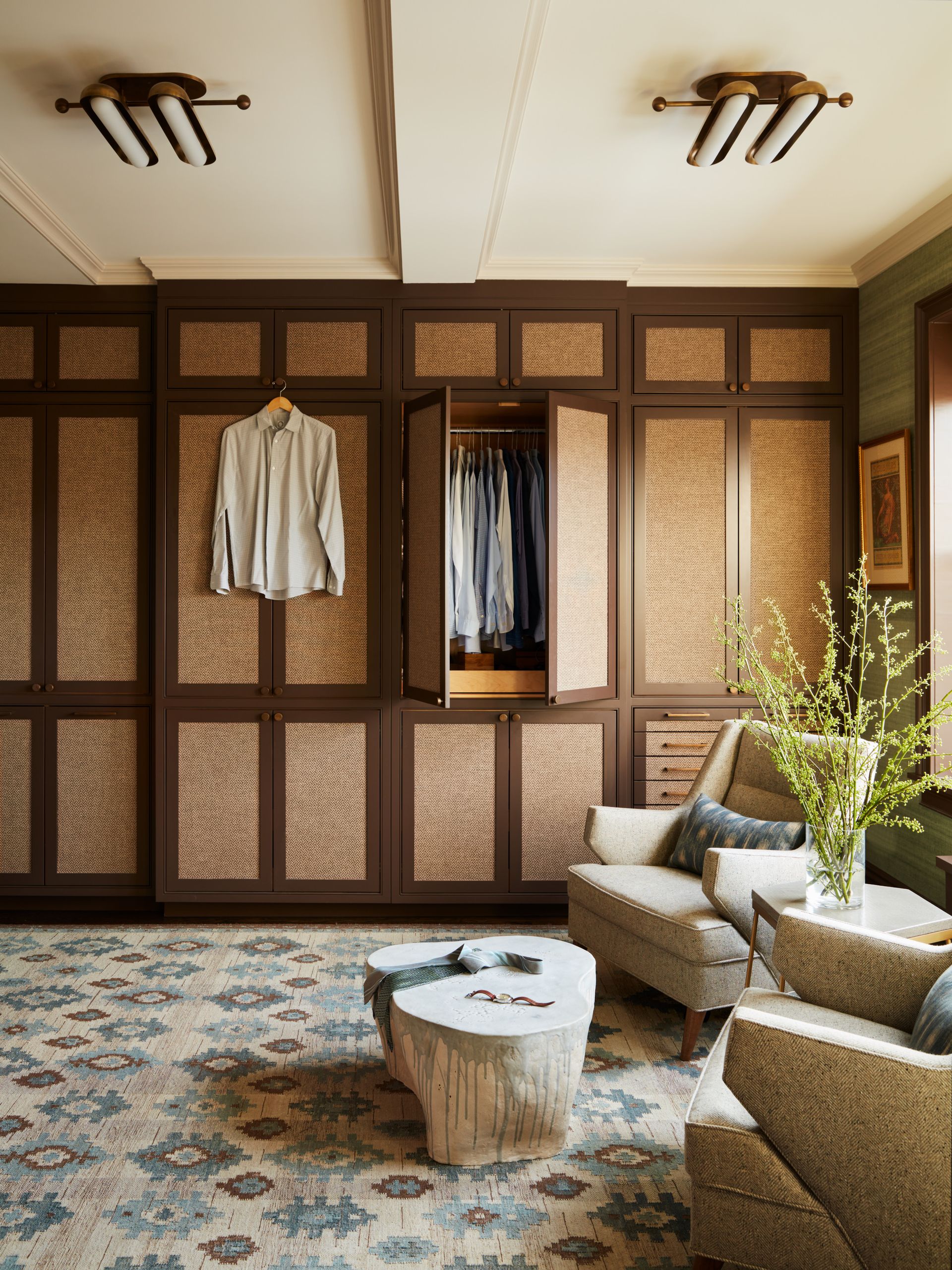
4. Mirrored closet doors
(Image credit: Mendelson Group/Tim Lenz)
I have a confession, I still have my mirrored closet from college. It is on its last legs and I am counting down the days until I can make the switch to built-ins. Why do I still have this furniture faux pas, you ask? While I don’t consider myself particularly sentimental, I couldn’t justify doing away with a functional piece of furniture that saw me from childhood to my teenage years. But even I, as a style editor, can admit that I own something so dated.
Mirrored closet doors, a beloved decorating must-have in the ’80s and early ’90s known for adding glamor (or so we desperately wanted to believe), also made small spaces feel larger. But while decorating with mirrors has soared in popularity in recent years, mirrored furniture, especially closet doors have fallen out of favor.
In its place, beautiful French doors, bi-folds, and pocket doors are bringing our homes up-to-date. In my opinion, closet doors aren’t always given the thought they deserve. Very often, we are far more invested in what’s behind them and what they can offer us, but they can have an enormous impact on the space, making it feel cozier, brighter, richer in texture, and bigger even.
5. Mass-produced homeware
(Image credit: James Merrell)
Interior design is an intricate and extremely personal process, therefore why do so many of us fall victim to the cookie-cutter aesthetic of mass-produced homewares?
The whole purpose of a home is to answer the needs of the individuals living in them whilst reflecting their personalities with good design, space, and functionality, which is why over-produced, impersonal purchases are making our homes look dated, and dare I say, cheap.
Thankfully, recent trends have shown a shift towards curating more sustainable, soulful spaces. ‘If in doubt, be bold,’ advises Tiffany Duggan, founder and director of Studio Duggan (opens in new tab). ‘Clients hardly ever regret investing in one-of-a-kind vintage pieces. Think of your space as a carefully curated Aladdin’s cave of treasures, with each item on display even more fascinating than the last.’
Undeniably, maximalism is back and it is better than ever. Not the big. blowsy florals from the ’80s, but a much more refined maximalism that is not only fashionable but also liveable and unique.
Style mavens such as hotelier Kit Kemp are masters in the fine art of maximalism. But if you’re new to this trend, you’d be wise to exercise caution, otherwise, your experimentation could end up one hot mess. So prefix maximalism with an adjective such as ‘considered’, ‘elegant’, or ‘curated’ and you can make it work. The trick to pulling off ‘elegant maximalism’ is finding a common hook off which everything else hangs. Leave matchy-matchy to the minimalists, you just go with whatever you love and it will work. Happy considered – and sustainable – gathering!

Jennifer Ebert is the digital of Homes & Gardens, overseeing all features for the website. Covering the popular interior design trends – and outdated trends – is her forte, as well as discovering the latest decorating rules to follow, and the ones to avoid.
