10 Things an Interior Designer Would Never Have in His Home and Why

10 Things an Interior Designer Would Never Have in His Home and Why

If you’re going to hang a poster at least put it in a frame.

fake plant, small stand, black leather chair and blac and white poster in frame in stylish room

Art can come in all sorts of forms, posters being one of them.

Followtheflow/Shutterstock


I don’t really have a problem with posters in general, but I take issue with their lazy aesthetic. Typically they’re taped onto the walls of college dorms. 

If you’re going to use a poster, dress it up by framing it. This helps the poster stand out more and makes it feel more like a design decision rather than a place filler.

By getting the same frame in multiple quantities you can also help unify a collection of posters and make them flow more cohesively through a space.

Popcorn ceilings are awful to look at and to take down.

popcorn ceiling

Removing popcorn ceilings is a rather inexpensive yet dramatic change that can positively impact a space.

Shutterstock


Popcorn ceilings can cause competing textures in a space and make it feel less open.

Without popcorn ceilings, a space is elevated. You also get an environment that lets the walls and furniture take the focus while leaving the ceiling out of the equation. 

I recently helped a friend take down popcorn ceilings in their new condo. Although it took hours to complete and all I got out of it was free pizza and half a bottle of wine, it really was worth it.


Futons give off college-dorm energy.

gray futon next to bookshelf with spines facing inward and light gray rug underneath and faux plants

Not only do futons rarely, if ever, add anything to the rooms looks-wise, but also they’re never comfortable.

Studio Light and Shade/Shutterstock


Many people use these as a bed for visiting guests but, speaking from experience, I’d rather sleep on a comfortable sofa than a futon with metal bars digging into my back.

If you host frequently and don’t have a spare room, I highly suggest investing in a nice air mattress instead of an uncomfortable futon. You can tuck an air mattress in the back of your closet when it’s not in use … good luck hiding that eyesore of a futon. 

In my opinion, bed skirts instantly age a space.

beige carpet, ceiling fan, black comforter, white bed skirt in room with nightstand

There are better ways to hide the stuff beneath your bed.

Hendrickson Photography/Shutterstock


Bed skirts make a space look like a museum, and they also remind me of my great-grandma’s room when I was growing up.

If bedding that reaches the floor is a priority for you, I’d suggest investing in a platform bed. It can give you a similar look while modernizing the bed and giving you one less piece of bedding to buy.

Fake plants and fruit aren’t worth it.

artificial fake plants centerpiece

Some real plants can be pretty easy to keep alive.

Shutterstock


Skip the fake stuff, especially since real plants enhance the overall environment of the space.

I understand not everyone was born with a green thumb but I’ve found that snake plants, aloe, and bamboo are some of the easiest plants to take care of.

There are also many apps that can track growth and tell you how much sun and water plants need — it takes all the guessing out of it.

There are so many ways to achieve a cohesive room without having every piece of furniture be from the same collection.

matching furniture set

Matching furniture sets are perhaps most common in bedrooms.

Shutterstock


I commonly see matching sets in master bedrooms, where the bed, nightstands, and dressers are all the same color and finish.

But it’s more visually interesting to switch your furniture up. I’d start with a fabric headboard to soften the space, a wood grain for a dresser, and a solid-painted nightstand set.

You can switch this combo up as desired, but the visual difference creates contrast.

We also commonly see sets in living rooms. Instead of getting the same sofa and love seat, try to choose two different fabrics that complement each other. Doing this reads less, “I got this on sale” and more, “I made this design decision on purpose.”

This may be controversial, but I’d never want an outdated-looking ceiling fan in my home.

wood accent wall bedroom ceiling fan plant

Really look at your options if you’re going to have a ceiling fan.

Shutterstock


I have never been one of those people that need to sleep with a fan on. In fact, I find it very difficult to sleep with a fan on and I dislike having them in a home.

Ceiling fans are certainly functional, but I cannot stand the look of them. I’ve seen people spend hundreds of thousands of dollars on renovations and new furniture sets just to have a ceiling fan floating above it all. 

If a ceiling fan is a must — for a lot of people, it is — I recommend really looking into different options and finding one that complements the overall design of your space instead of one that sticks out like a sore thumb.

I think typical recliners are such a waste of space.

red leather recliner chair

If you’re getting a recliner, get one that’s more subtle.

Paul Vinten/Shutterstock


Although I can admit classic, puffy recliners are just about the comfiest pieces of furniture I’ve ever sat on, I prefer to find a balance of comfort and aesthetics.

These days, you can find seamlessly designed recliners that look like regular accent chairs. Or you get an ordinary chair and add an ottoman.

You can kick your feet up on an ottoman, use it as extra seating, and have it add a pop of color or a pattern to your space.

Black bedding may look good at first, but it’s not worth the headache of keeping it clean.

white bedroom with black comforter and dark headboard with side table and black lamp

I had black bedding once and I immediately got rid of it.

JR-stock/Shutterstock


I’ve been saving photos of chic beds with black duvets and pillows on Pinterest for years, but when I finally got black bedding it was a disaster. 

It looked great for the first couple of days but then every single piece of dust or hair in the room started to accumulate on it.

I would lint roll and vacuum the bedding in the morning before work and, by the time I got home, it would look like it was dragged through an alley all over again.

It became such an eyesore I didn’t even keep the bedding on for a full week.

Instead, get black accent pillows or throw blankets that can help you achieve a similar look while saving you the headache of constant cleaning. 

Designer Shannon Eddings Transformed a Five-Bedroom House in Austin Into the Ultimate Bachelor Pad

Designer Shannon Eddings Transformed a Five-Bedroom House in Austin Into the Ultimate Bachelor Pad

How do you make a 4,167-square-foot, five-bedroom home functional for just one person? That’s what a bachelor returning to his native Austin, Texas, tasked interior designer Shannon Eddings with accomplishing after he found a classic 1980s home steps from a beautiful hiking trail.

“It was a very different experience working for one person who would be living alone in such a large space,” says Eddings. “Our client loves color, pattern, the 1970s, and music, so we took that into account when creating the interior decoration. He also has a penchant for English eclectic design, which is basically my middle name these days. I can’t get enough of the quirky, colorful approach that a lot of English designers take when decorating.”

The home had been updated in the early 2000s but was otherwise untouched. Eddings worked with the homeowner’s contractor to gut the bathrooms and add updated custom cabinetry; open up the wall between the kitchen and family room; and replace the flooring throughout the house with new wood flooring. The kitchen was updated by the previous owner, so Eddings simply painted and replaced the hardware and lighting.


preview for Design School

To best make use of the space, Eddings converted one of the bedrooms into a music studio, another into a gym, and then combined another with the primary bedroom to create an office. In the primary, she also created an in-bedroom sitting area with a record player.

“It’s such an exciting challenge to bring architectural detail and interest into a basic spec-like home,” says Eddings. “It’s key to layer in bold paint and pattern to create some tension and excitement in the home.”

She did just that with custom window treatments by Zak+Fox; Sanderson wallpaper paired with green cabinetry in the powder bathroom; William Morris wallpaper in the dining room; Turkish and Moroccan rugs; and saturated paint hues.

“Don’t be afraid to take risks with color and experiment with unique and unexpected shades,” says Eddings. “When a client trusts us to decorate everything, the finished home just flows so much better.”


Living Room

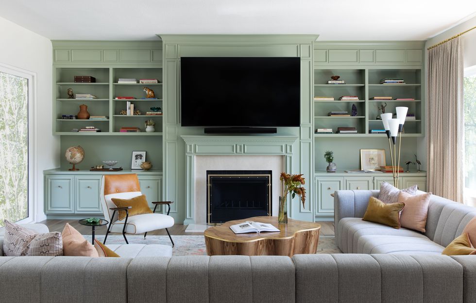
living room with grey sectional and green built in shelving

Molly Culver

Instead of tearing out the outdated built-ins, Eddings added custom moldings and bright green paint. The sectional is by Four Hands, the coffee table is Arteriors, the chair is by Anthropologie. Eddings also installed a Turkish oushak rug.


Kitchen

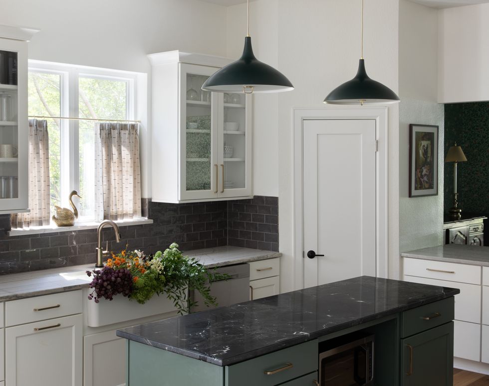
kitchen with black pendant lights and black granite countertops

Molly Culver

Adding a fresh coat of paint, replacing the hardware, and updating the light fixtures made all the difference in this kitchen.


Breakfast Table

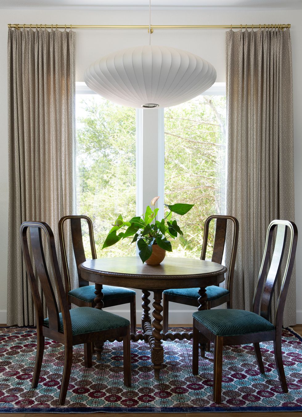
round table with 4 upholstered chairs

Molly Culver

“We saved money in the kitchen nook by sourcing the antique dining chairs and the light fixture above the table off Craigslist,” says Eddings. “We were running out of money and had to get creative. In getting creative, we also got lucky.”


Dining Room

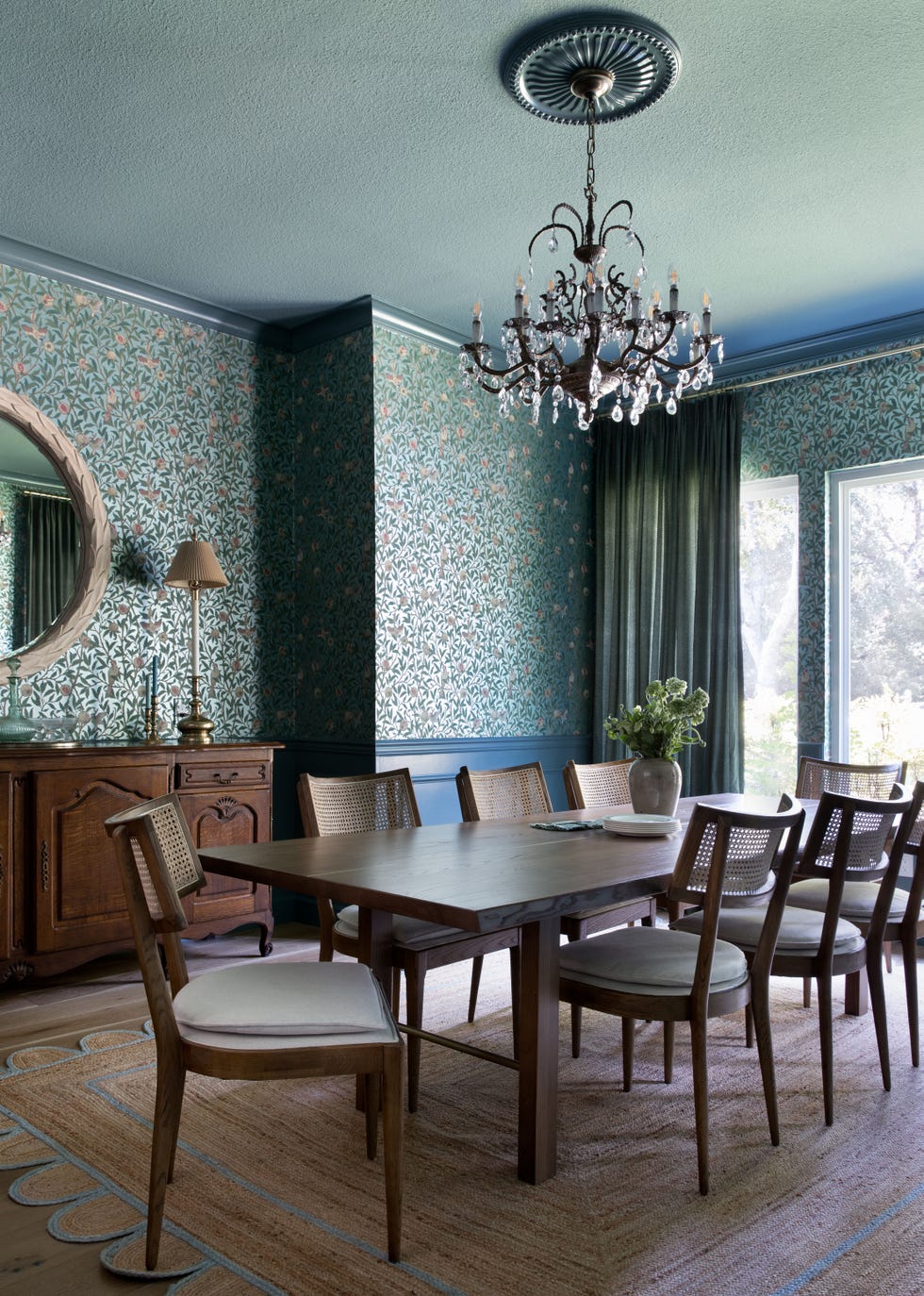
dining room with long table, chandelier, and teal wallpaper

Molly Culver

A standout William Morris wallpaper pops against antique furniture in the dining room.


Primary Bedroom

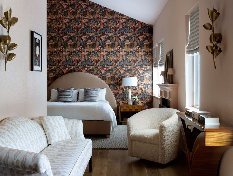
primary bedroom and sitting area

Molly Culver

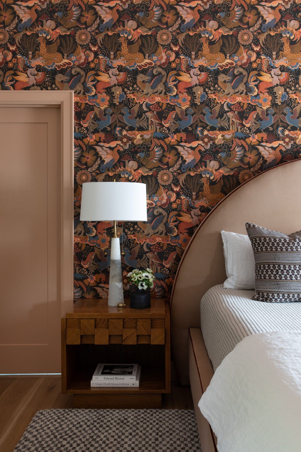
wooden nightstand and bird wallpaper in primary bedroom

Molly Culver

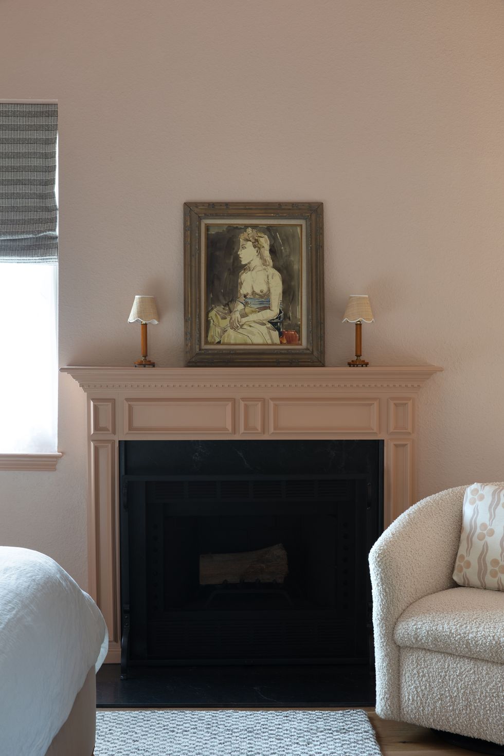
blush bedroom walls and fireplace

Molly Culver

“We designed a really beautiful bed with a big curved arch on the headboard in Italian velvet with contrast trim,” says Eddings. “We love the detail and the bun feet.” She also installed House of Hackney wallpaper.


Primary Bathroom

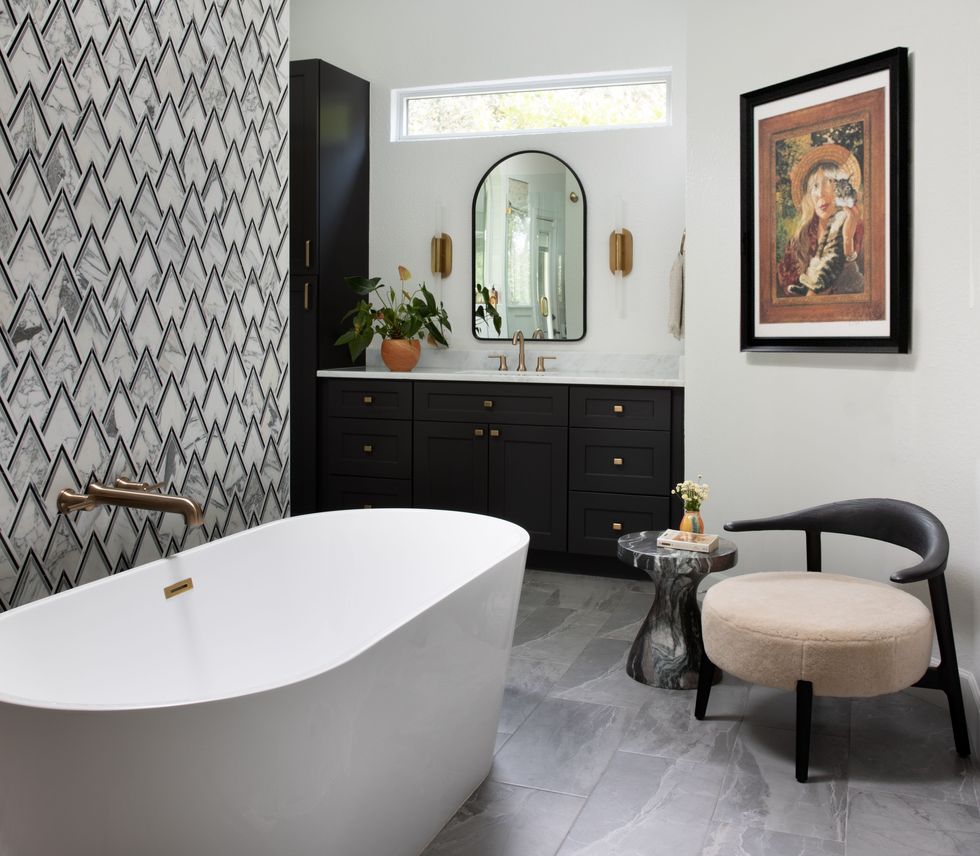
bathroom with tub and geometric wallpaper

Molly Culver

A black-and-white palette makes for a soothing transition from the primary suite.


Guest Bedroom

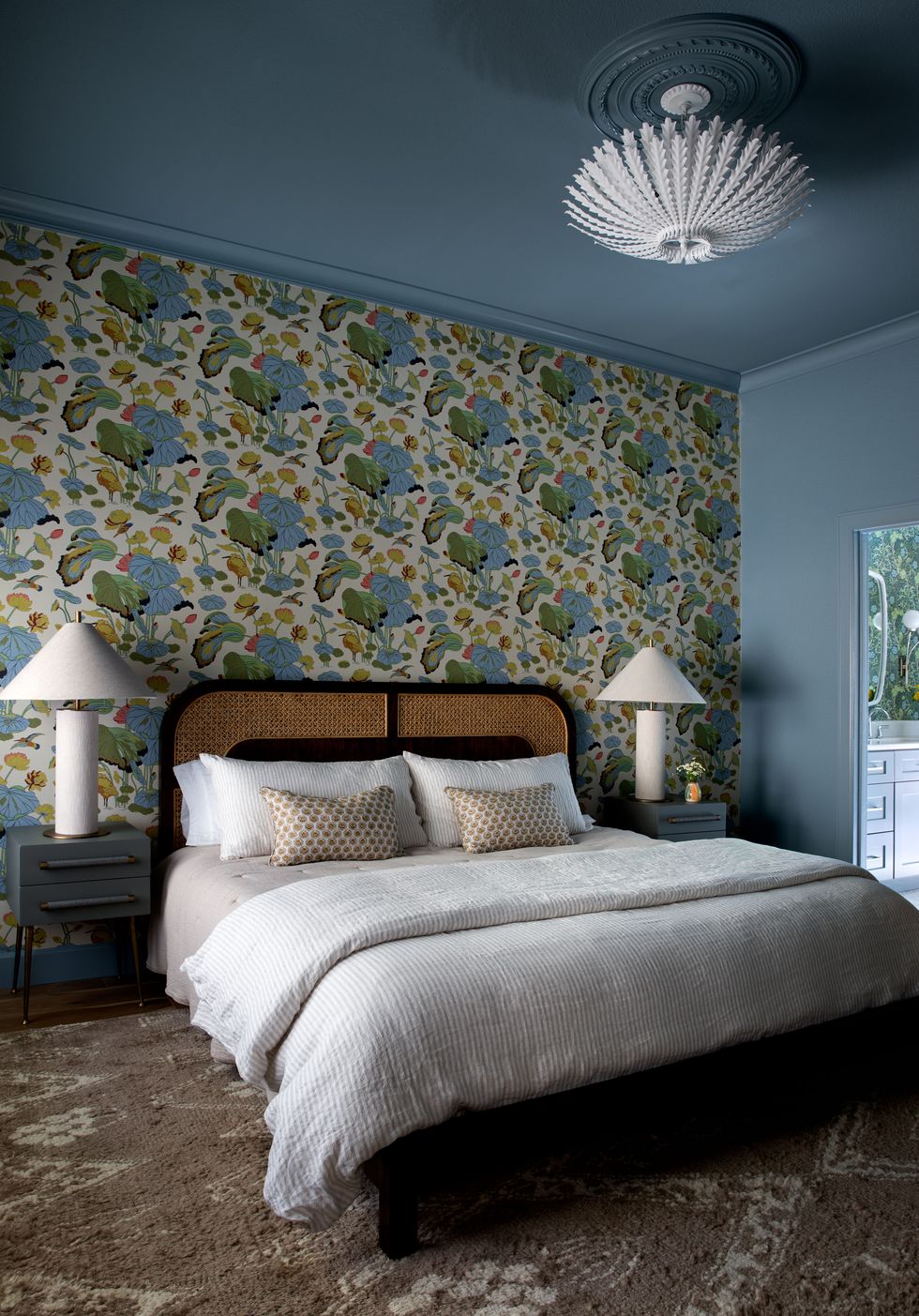
bedroom with colorful leaf wallpaper and symmetrical bedside tables

Molly Culver

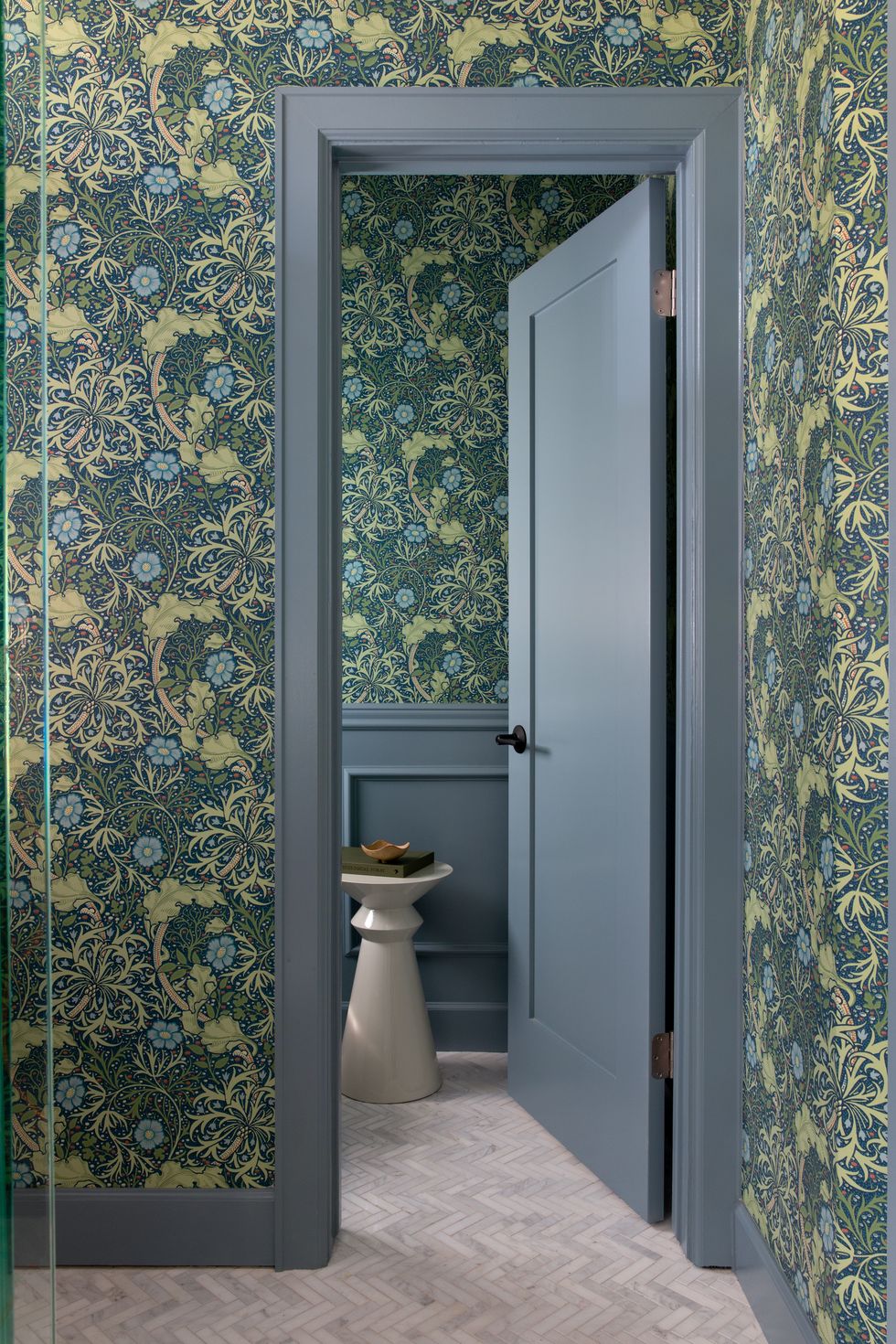
bathroom walls covered in green botanical wallpaper

Molly Culver

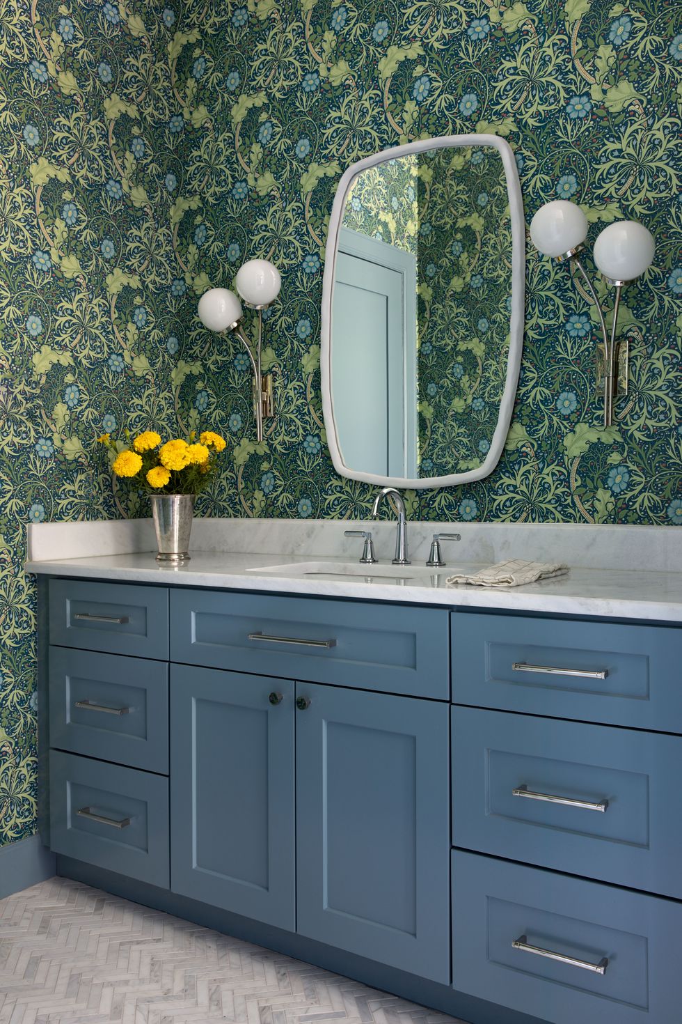
bathroom with blue cabinet and green floral wallpaper

Molly Culver

The wallpaper is by G P & J Baker, the nightstands are Chelsea Textiles, the lamps are Crate & Barrel, and the bed is by CB2.


See More of the House

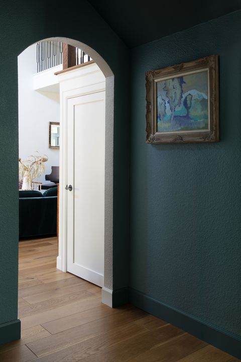
dark blue hallway with arched doorway

Q & A

HB: What was the process like?

SE: When your client is in love with the 1970s, it’s exciting but can be a little scary trying to rein in some of the pattern and color. It was really cool to see him respond to some nice classic wallpaper patterns and see him respond to the more refined ideas we had that hinted at the 1970s. The wallpaper in the powder bathroom from Sanderson is the most 70s looking piece in the house, and we all loved the way it turned out with the green cabinet.

HB: What were some challenges along the way?

SE: The most difficult part of the whole project was navigating the availability of furniture and fabrics due to the pandemic. The whole remodel took place in the thick of Covid, so it changed the way we decorated. We ended up sourcing a ton of vintage furniture.

HB: Where’d most of your budget go?

SE: We invested heavily in custom window treatments as well as wallpaper and light fixtures. We love furnishing homes. The best and most successful projects are the ones that include the finishing touches. We love to pull out a color that is hinted at in a wallpaper and use it on the cabinet or walls. Another great example of this is on the walls in the primary bedroom, where we went with a peachy pink to complement the tones in the House of Hackney wallpaper.


Follow House Beautiful on Instagram.

How Designer Raili Clasen Completely Overhauled a 1950’s Home

How Designer Raili Clasen Completely Overhauled a 1950’s Home
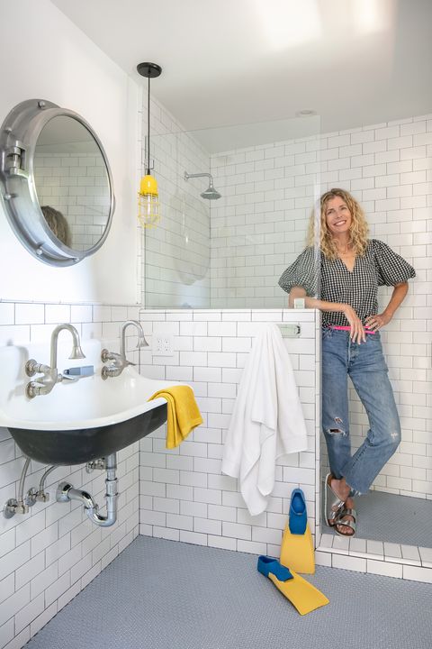
designer posing in the bathroom

Designer, Raili Clasen

Ryan Garvin

Interior designers rarely design the same project twice, and even more rarely get to redesign their own former home… for a client. California-based Raili Clasen, however, did both. The owner of her eponymous design firm recently completed the five-bedroom Newport Beach bungalow that she originally designed for her family in 2012. This time around, though, she lovingly decorated the house for a client. Clasen says, “After we bought the home in 2012, it was my first attempt at interior design, which then prompted me to start my design business.”

Since she and her family moved out, the house has undergone a few changes, including a pool, pool house, and 1,000 square feet of extra space, giving Clasen plenty of room to work. That said, she kept with the original home’s style: “We honored the California ranch style by keeping the open beam ceilings and elevated the design with rich mahogany windows and vintage hardwood floors,” Clasen notes.

As for the client, “He has elevated taste but didn’t want the home to feel formal in any way,” she explains. So Clasen infused each space with warm and comforting palettes and touchable, soft textures.

She also made it family-friendly for the client’s three young children, a delightful redo for Clasen who added smile-inducing details. “Since this was my former home, I had some fun ideas that I never punted on; my DIY skills went into overdrive.” She wrapped the bar beams with rope—a subtle nod to the Southern California nautical lifestyle—painted a set of 1970s-inspired stripes across the reclaimed wood walls in one of the bedrooms, and created her own light fixture using electric-ready rope from Etsy.

“The home feels like a mini resort, ready to have fun,” Clasen says.


Living Room

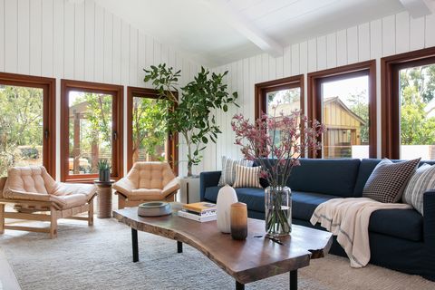
living room with couch and lounge chairs

Ryan Garvin

“My favorite element in this room is the painted ‘craggy’ wood siding that we added throughout both the living area and kitchen,” Clasen says. “We found the most worn wood planks with knots and gashes and installed it vertically with a fresh coat of white paint.” The space is complete with a custom sofa, a pair of Lawson-Fenning chairs, and a custom live-edge coffee table by Orange County Woodworkers.


Living Room Lounge

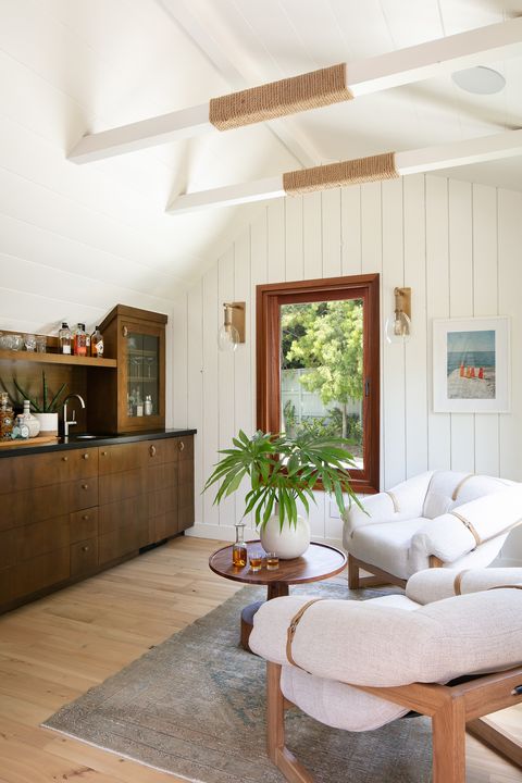
living room lounge

Ryan Garvin

“The home had a perfect little bump-out space, most likely for a small office. We reimagined it as a full bar. The original beams were wrapped in rope to complement the vintage boat cabinet hardware,” Clasen says. She finished the look with a pair of chairs from Four Hands and a vintage rug from Shoppe Amber Interiors.


Primary Bedroom

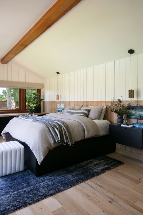
primary bedroom

Ryan Garvin

In the main bedroom, Clasen opted for a quiet and serene aesthetic. “The primary bedroom is one of my favorite spaces—mostly because of the beautiful views of the sunrise, swimming pool, and all of trees.” The best part is that the client doesn’t even have to get out of the custom built-in bed to enjoy the views.


Daughter’s Bedroom

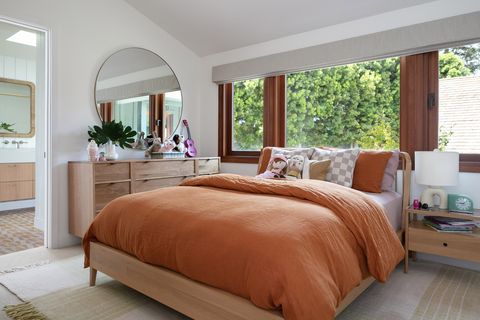
bedroom with large windows and orange linens

Ryan Garvin

For a young girl with an appreciation for color, Clasen opted for uncommon shades that work for every age. “We wanted to tone it down so that she can grow out of it and still love the colors,” she notes. She draped a Cultiver duvet over the bed, hung a CB2 mirror over the Unison dresser, and called it a day.


Daughter’s Bathroom

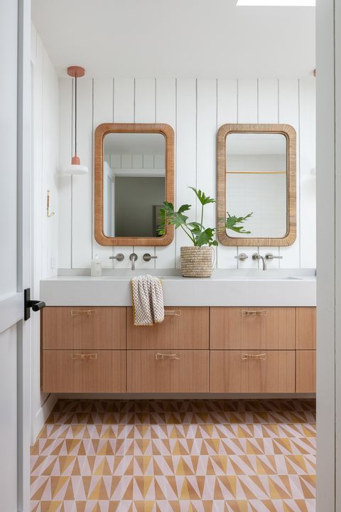
bathroom vanity with 2 mirrors

Ryan Garvin

Clasen explains: “We had so much fun with tile throughout the home, but the daughter’s bathroom is special.” The designer used a funky pattern from Zia Tile and kept the rest of the space rather neutral, with wicker-wrapped Lulu and Georgia mirrors and decor.


’70s Striped Bedroom

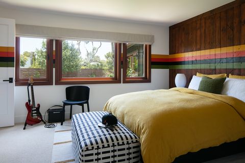
bedroom with wood paneling wall

Ryan Garvin

Leave it to Clasen to design spaces that suit the lifestyles of her clients—even teenage boys. “The oldest son’s room reflects exactly who he is and what he loves. This teenager is no stranger to ’70s rock, and once we discovered that, we had to bring in the stripes.” The rest of the colors, including the yellow Cultiver bedding and the Like Leigh fabric on the custom bench, also tie in the theme.


Bunk Room

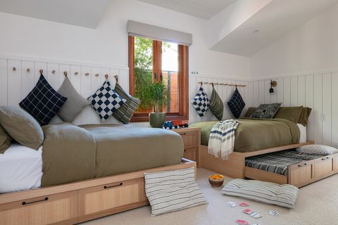
room with 2 trundle beds

Ryan Garvin

Clasen created the ultimate sleepover room with custom trundle beds by Orange County Woodworkers.


Wave Bedroom

bedroom

Ryan Garvin

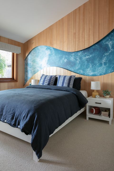
In the middle son’s bedroom, Clasen designed a unique wall decoration that commands attention. “The wave was created by applying a photo mural directly onto the wall. Our woodworker created the frame once the mural was installed, cutting each piece to mimic the shape of a wave.”


Pool and Backyard

pool in backyard

Ryan Garvin

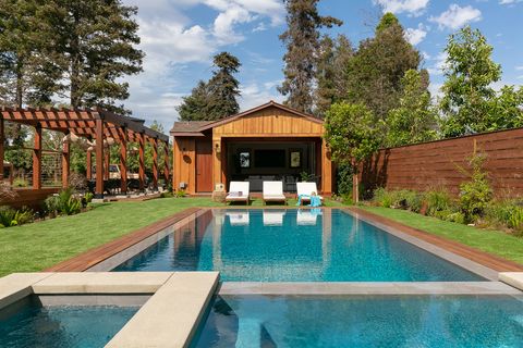
Clasen says: “The client wanted to take advantage of the 20,000-square-foot lot, adding space for him and his three kids.” That meant the addition of a retaining wall to support the new pool, fire pit, garden, and pool house.


Outdoor Dining Area

dining table in backyard

Ryan Garvin

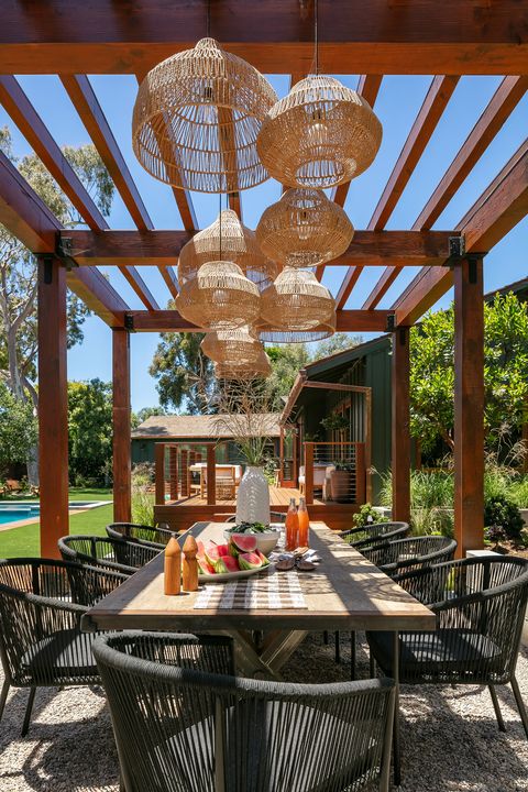
“The inspiration for the outdoor space comes from creating the ‘resort vibe’ in cool boutique hotels. Having a fire pit, farm-to-table gardens, and space for outdoor entertaining was a major priority for this backyard,” Clasen says. She surrounded the client’s table with Teak Warehouse chairs and opted for a collection of hanging lights from Crate & Barrel.


Al Fresco Bar

outdoor bar attached to kitchen

Ryan Garvin

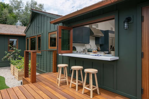
“The pass-through window services the entire outdoor area, allowing easy access to drinks and food while family and friends are enjoying the pool. Clasen notes. “The kitchen is on the other side of the window, so guests can pull up a stool and chat while the hosts are prepping the meals and drinks.”


Explore More of The House

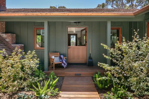
front entrance of a green house

Q & A

House Beautiful: Where did the majority of the budget go?

Raili Clasen: The client wanted the vision to come to fruition: He wanted mature trees and full-size plantings, so that he and his family could start enjoying the outdoor space immediately. So the budget for landscaping by Bridget Skinner increased.

HB: What was your favorite memorable detail?

RC: Since this was my former home, it was both nostalgic and a dream-come-true to have the budget and excitement from the client to give this special property its best chapter ever.

HB: Did any of the rooms stay as they were?

RC: The kitchen actually remained the same. We did add a pass-through window, updated the plumbing and lighting, and incorporated an island with a butcher block countertop, but the rest is the same. The kitchen is small, but with the remodel, we were able to build a comfortable pantry adjacent to the space.


Follow House Beautiful on Instagram.